0. Information
After login, a page with basic information about the service is displayed.
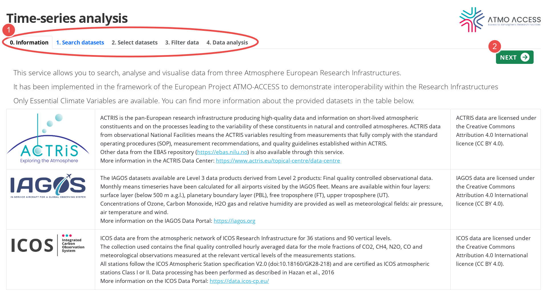
The user can follow to the next step either by using the top navigation bar (1), or the button “Next” (2).
1. Search datasets
This first stage is devoted to searching for available datasets, which will be analysed next. The search depends on:
- Selection of Essential Climate Variables (ECV), see Legend 1 on Figure 1
- Selection of measurement stations (2): ACTRIS and ICOS ground-based stations, IAGOS vertical profiles above airports and regions with IAGOS measurements at ~10 km.
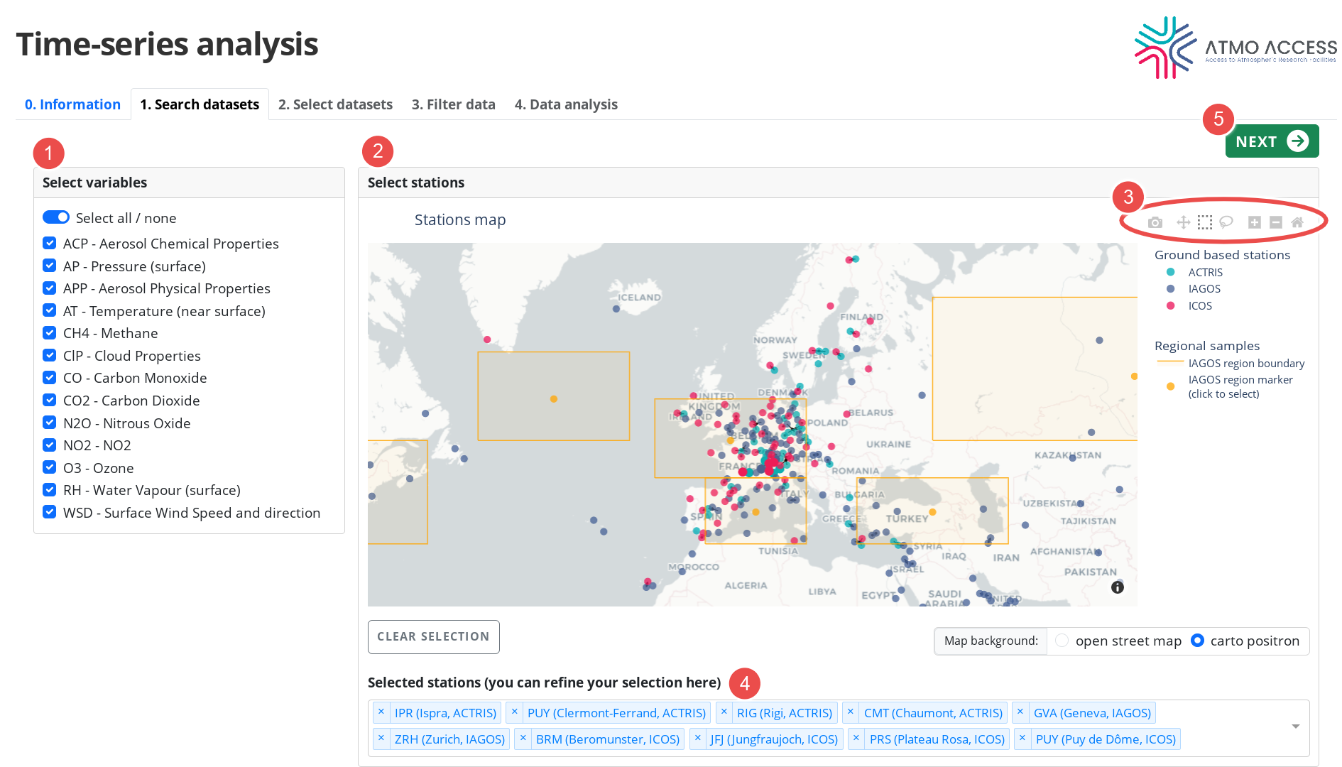
In order to select measurement stations on the map, the user can either:
- Click at the individual station
- Use drag-and-drop in order to select an ensemble of stations inside a designated region. It works whenever the figure controller (3) is in the mode
- “Box Select” (dashed-square icon; this is a default mode), or
- “Lasso Select” (lasso icon).
Either of the selection methods (click or drag-and-drop) adds stations to those already selected. The selection can be reset using the “Clear selection” button or an individual station can be removed from selection by removing it from the list (4).
Clicking on an item of the map legend allows to hide a corresponding group of stations (e.g. all ACTRIS stations), which can facilitate the station selection process.
Apart from stations selection, the figure controller (3) allows for:
- Figure download (camera icon)
- Pan (arrows icon)
- Zoom in / Zoom out (+ / – icons; note that for zoom a mouse wheel or a two-finger vertical scrolling gesture can be used)
- Reset view (house icon)
In order to submit the search based on the selected variables and stations, the user should click on the button “Next” (5), which will send the user to stage 2. Select datasets
2. Select datasets
The aim of this stage is to select datasets that will be used for analysis.
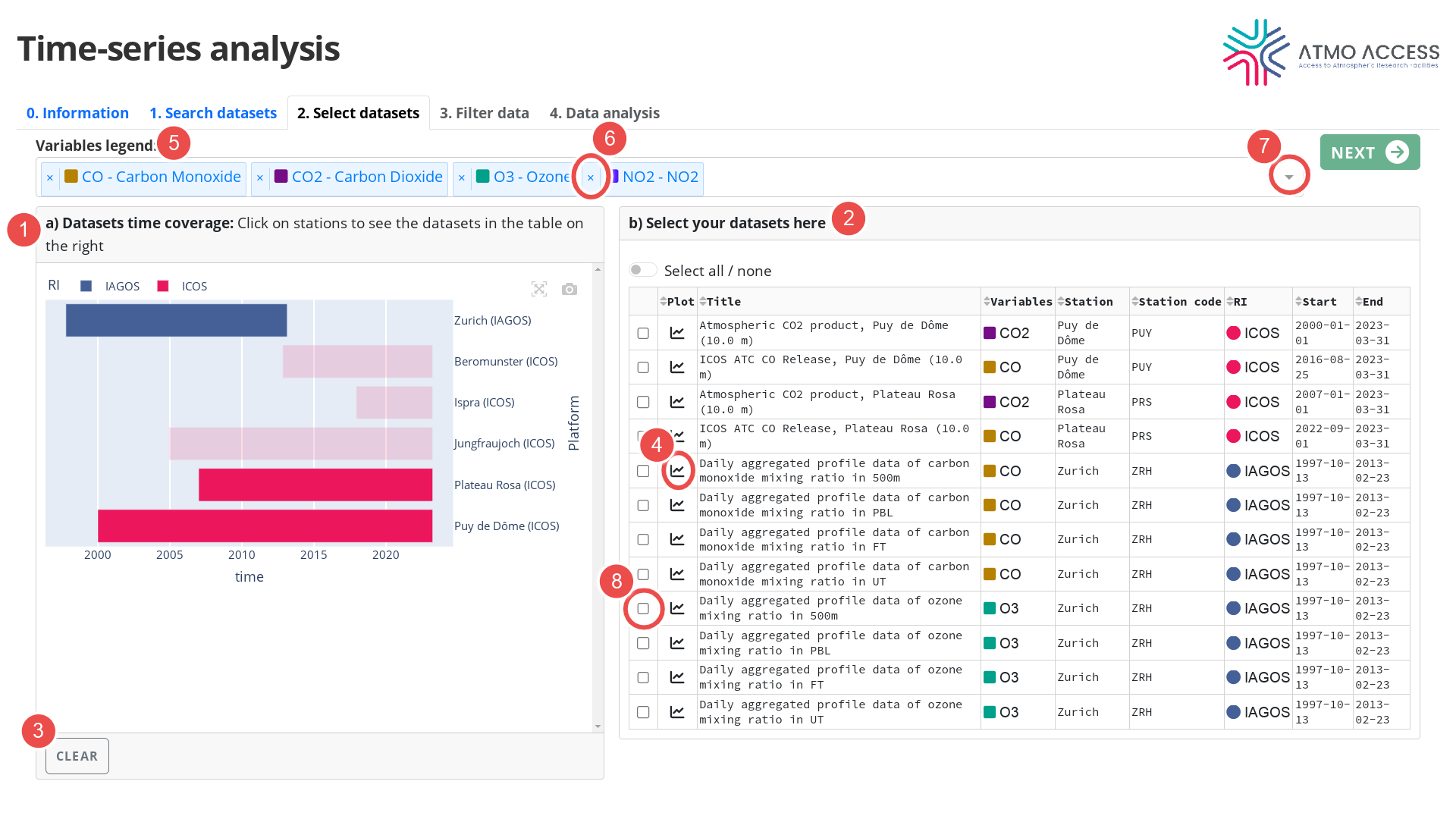
The plot in the left panel “Datasets time coverage” (see Legend 1 on Figure 2) represents an ensemble of datasets found by the search query (cf. Step 1. Search datasets). The datasets are grouped by station, and for each station a horizontal bar shows temporal extent of the corresponding dataset(s).
A click on a horizontal bar results in showing up information about the corresponding datasets in the table in the right panel (2). A second click on the horizontal bar will unselect it and remove the corresponding rows from the table. The horizontal bars selection and the table can be cleared with the “Clear” button (3).
The table in the right panel (2) contains basic information on available datasets:
- Title
- Variable(s)
- Station name and station code
- Temporal extension of the data
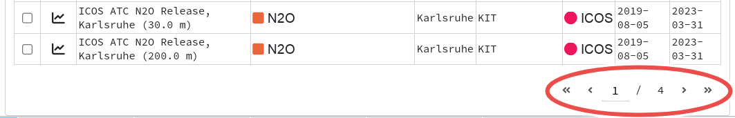
In case the table contains many rows, pagination is applied, as shown on Figure 3.
Clicking on the graph icon (see Legend 4 on Figure 2) shows a plot of the time-series data contained in the corresponding dataset.
The variables in the table are identified by their abbreviation and a colour code. The corresponding full ECV name is visible in the “Variables legend” (5).
Hint: It is possible to drop a variable from the “Variables legend” (by clicking on the cross icon (6)). Doing so will result in restricting the results displayed in the panels (1) and (2) (see Figure 2). A dropped variable can be included back into the legend by using a dropdown menu (see the down arrow (7)).
Finally, the user can choose up to 10 datasets (using the check boxes (8)) for a subsequent analysis of the time-series data contained therein. The choice of the datasets is confirmed by clicking on the “Next” button which leads the user to the next stage of the workflow.
3. Filter data
Once the choice of datasets is confirmed in the previous step, the user can now analyse the time-series data contained therein. Each variable from the datasets is assigned
- a unique identifier composed from the variable name, station name, etc.
- a colour code
which are going to be used throughout the subsequent steps of the workflow.
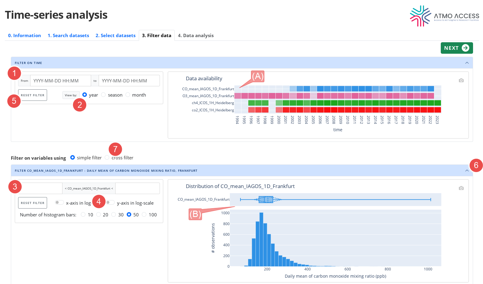
The “Filter data” step allows the user to inspect the data and, optionally, setup filters. For each variable the user can see:
- A heat map with data availability (for all variables) (see legend A on Figure 4)
- A histogram and box plots with the data distribution (one for each variable) (B)
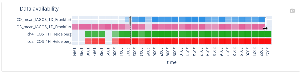
A filter on time (which restricts all variables to a chosen time interval) can be set up using begin and end date input (1) or making a drag-and-drop selection gesture on the heatmap plot (A), as shown on Figure 5. Granularity of the heatmap plot can be changed using the switch (see Legend 2 on Figure 4).
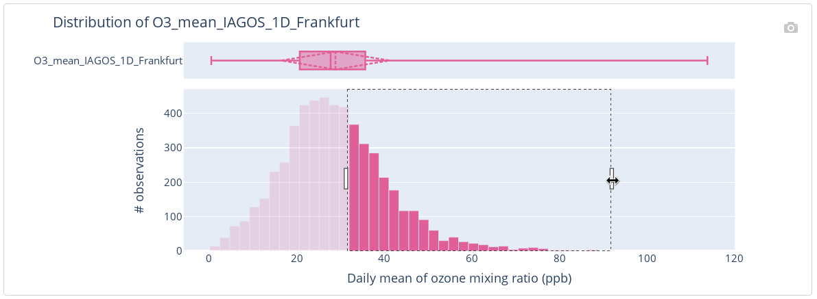
A filter on a variable value (which restricts the variable’s observations to those with values contained in a chosen range) can be set up using a manual input (see Legend 3 on Figure 4) or making a drag-and-drop selection gesture on the histogram part of the variable’s distribution plot (B), as shown on Figure 6. The distribution plot view can be adjusted using several switches (see Legend 4 on Figure 4).
Any of the filters can be reset using the corresponding “Reset filter” button (see Legend 5 on Figure 4).
The filters setup (or a setup of no filters) is confirmed with the button “Next” which leads the user to the next step.
Note that setting up a filter on time impacts the plots of the variables’ distributions (B) – they show the distribution of the variables restricted to the chosen time interval. This is also true in the other way – setting up a filter on values of a variable impacts the heatmap plot (A) of that variable availability (it shows the percentage of variable’s observations that satisfy the filter). This allows the user to obtain some insight on the data before even looking at the actual time-series (which comes in the next step).
Tip: In order to save on vertical scrolling, a panel with the heatmap plots and any panel with the distribution plot, can be folded (and unfolded) (6).
Advanced feature: The user can choose a cross filter (7). Doing so, all the variables are considered jointly, i.e. they form a single time-series of multivariate observations. As a result, any filter set up on a variable values restricts all variables.
4. Data analysis
At this step the user can perform an actual analysis of the data. A result of the analysis is displayed in a form of an annotated plot which has many interactive features:
- Using the figure controller (see Legend 1 on Figure 7) the user can zoom-in or pan onto an area of interest, reset view or download the figure (by clicking on the camera icon).
- A drag-and-drop gesture over the x- or the y-axis shifts the axis, while a scrolling gesture changes the axis’ scale.
- Double-click on an annotation item (title, axis annotation, legend items, see the underlined elements of the plot on Figure 7, e.g. Legend 2) allows for the annotation edit, which can be useful before eventual figure download.
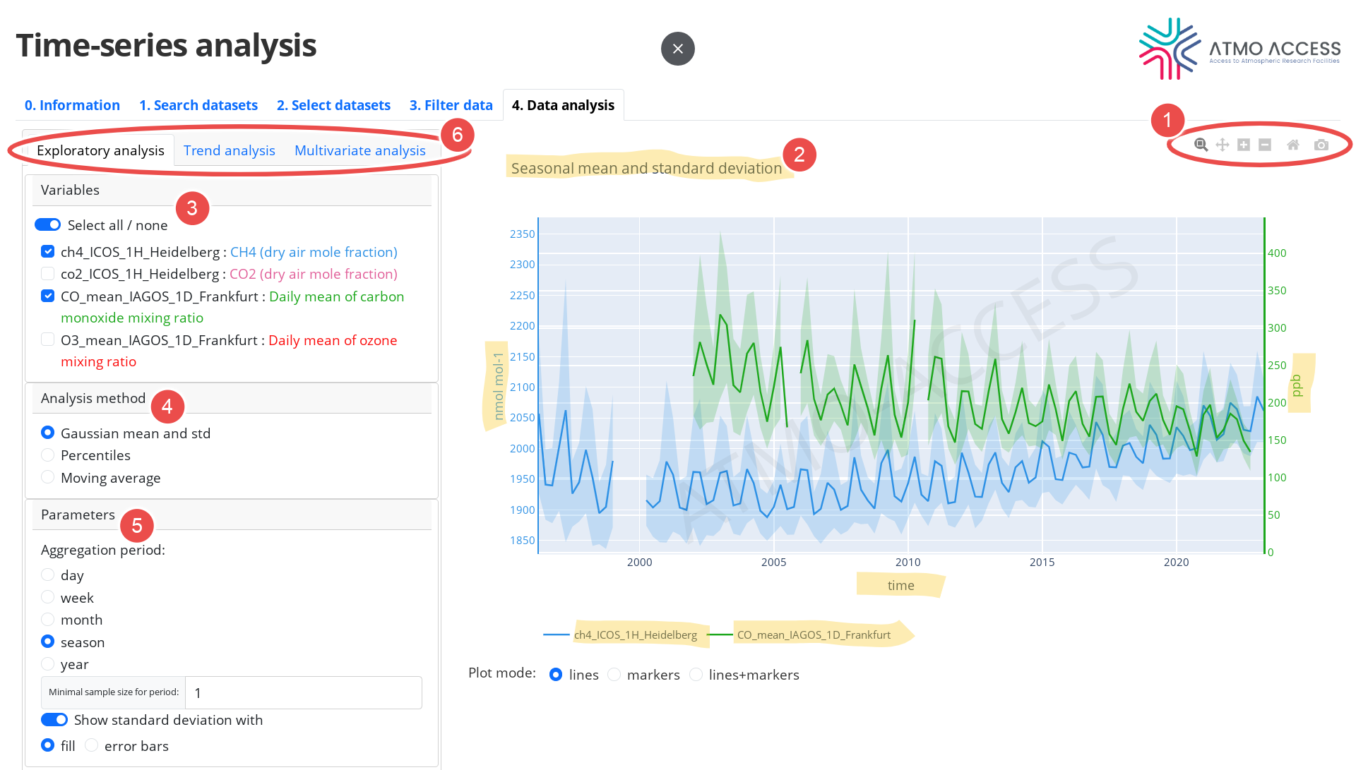
The data analysis concerns one or several variables, which can be chosen in the dedicated panel (3). The analysis itself is performed by using one of the available methods (4), each having its specific parameters (5) to be set by the user. The methods are divided into three groups (6):
- exploratory analysis,
- trend analysis,
- multivariate analysis.
4.1. Exploratory analysis
Analysis methods aiming at exploration of time-series of individual variables are grouped into exploratory analysis methods. The methods are:
- Means and standard deviations
- Percentiles
- Moving average
The user can choose the method in the panel “Analysis method” (see Legend 1 on Figure 8).
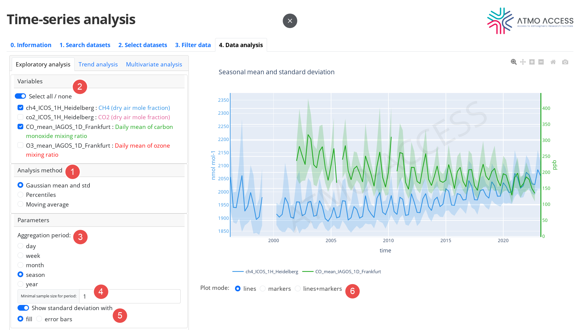
The user can choose one or several variables for the analysis (2). Despite the fact that the time-series of each variable is processed independently from the others, the resulting plots are superposed in order to facilitate the user with a comparative analysis.
Parameters which are common for all three exploratory analysis methods are:
- Aggregation period (3): it defines the time periods over which the desired statistics (means, standard deviations, percentiles, etc.) of the time-series should be calculated. In case of moving average it is the size of the moving window.
- Minimal sample size for period (4): a minimal number of observations of a variable per aggregation period (or per a moving average window) required in order to calculate the statistics for a period.
Additionally,
- for the means and standard deviations method the user can adjust the way the standard deviation is presented on the plot (fill area or error bars), see (5);
- for the percentile method the user can choose which percentile(s) should be calculated and plotted.
4.2. Trend analysis
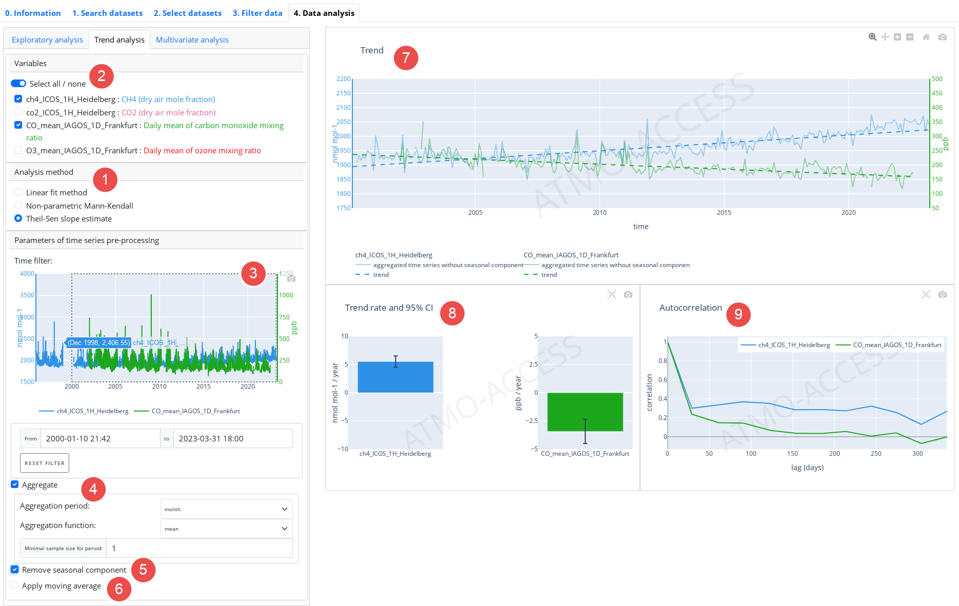
Analysis methods aiming at identifying and estimating trends in time-series of individual variables are grouped as trend analysis methods. The available trend estimation methods can be chosen in (see Legend 1 on Figure 9) and are the following:
- Linear fit method
- Non-parametric Mann-Kendall test
- Theil-Sen slope estimate
Similarly to the Exploratory analysis, the user can choose in panel (2) one or several variables for the trend analysis.
Time-series can be prepared for the trend estimation by applying operations from the following chain of operations:
- Time filter (3): allows to refine the time domain; the user can select a time interval using drag-and-drop gesture on the time-series preview plot or input begin and end dates (cf. Figure 6 in 3. Filter data for a similar feature)
- Aggregation (4) of time-series using daily / weekly / monthly / seasonal / yearly mean or median
- Seasonal adjustment (5): removes a seasonal component from the time-series. It uses a basic method of estimating the seasonal component which consists in
- applying first the moving average with the window size of 1 year
- grouping the resulting time-series modulo 1 year and averaging within each group
- centering the obtained 1-year long time-series and extending periodically for all the years.
- Moving average (6) with window size which can be set to day, week, month, season or year (available only if the seasonal adjustment is applied).
Note that the above chain of operations is applied to an original time-series in the above order, e.g. if a weekly aggregation and the seasonal adjustment is chosen, the seasonal component will be removed from weekly aggregated time-series and the resulting time-series will be an input for the trend estimation.
The results of the trend analysis are visualised using several figures:
- Trend (7), which shows
- time-series which is used as an input for the trend estimation (e.g. the time-series resulted in applying weekly mean and the removal of seasonal component, if those operations are chosen)
- trend line as estimated for the input time-series if linear fit or Theil-Sen slope estimation is used.
- In panel (8) the result of the trend analysis itself is presented. Depending on the method chosen, it is:
- For Linear fit and Theil-Sen slope estimate:
- Trend rate and 95 % confidence interval of the trend rate estimation
- Autocorrelation function of the detrended time-series (i.e. the time-series used as an input for the trend estimation minus the estimated trend).
- For Non-parametric Mann-Kendall test:
- A result of the test.
- For Linear fit and Theil-Sen slope estimate:
- In panel (9) the autocorrelation function is presented. It allows the user to adjust the pre-processing parameters (4)–(6), before the proper trend estimation or test is performed.
4.3. Multivariate analysis
Analysis methods that aim at exploring dependence between two or three variables are grouped as multivariate analysis methods. The input data for these methods are prepared as follows:
- The user chooses two or three variables (1) among those selected and filtered in the previous steps. The variables are labelled as X, Y (and C, in case of three variables), which determines how the variables are presented on the plot.
- For each of the two (or three) variables to be analysed, a time-series of observations of the variable issued from the 3. Filter data step is identified.
- The two (or three) time-series identified above are merged together in a form of a multivariate time-series; since each variable time-series could possibly have a different time resolution, a time-series upsampling method is used if necessary.
- Finally, the time axis is ignored; this results with an ensemble of multivariate observations, which constitutes data for a subsequent multivariate analysis. The total number of observations is visible in (1).
The available multivariate analysis methods (2) are:
- Scatter plot
- Linear regression
4.3.1. Scatter plot
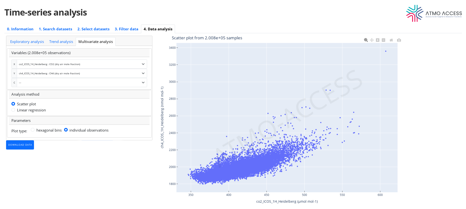
The Scatter plot method allows to visually explore dependence between two or three variables.
4.3.1.1. Two variables
In the case of two variables the user can choose (5) one of the two visualisations:
- 2D density plot (3) in the form of hexagonal bins — each hexagonal bin on the XY-plane (where X and Y refer to the variables chosen by the user at the start of the analysis) is coloured according to a number of observations of X and Y variables falling into the bin (4). Resolution of the hexagonal lattice can be adjusted (5) from 10 to 60 hexagons along the X-axis.
- 2D scatter plot (see Figure 11) of individual observations; note: this type of plot may be not very suitable in the case of a large number of observations.
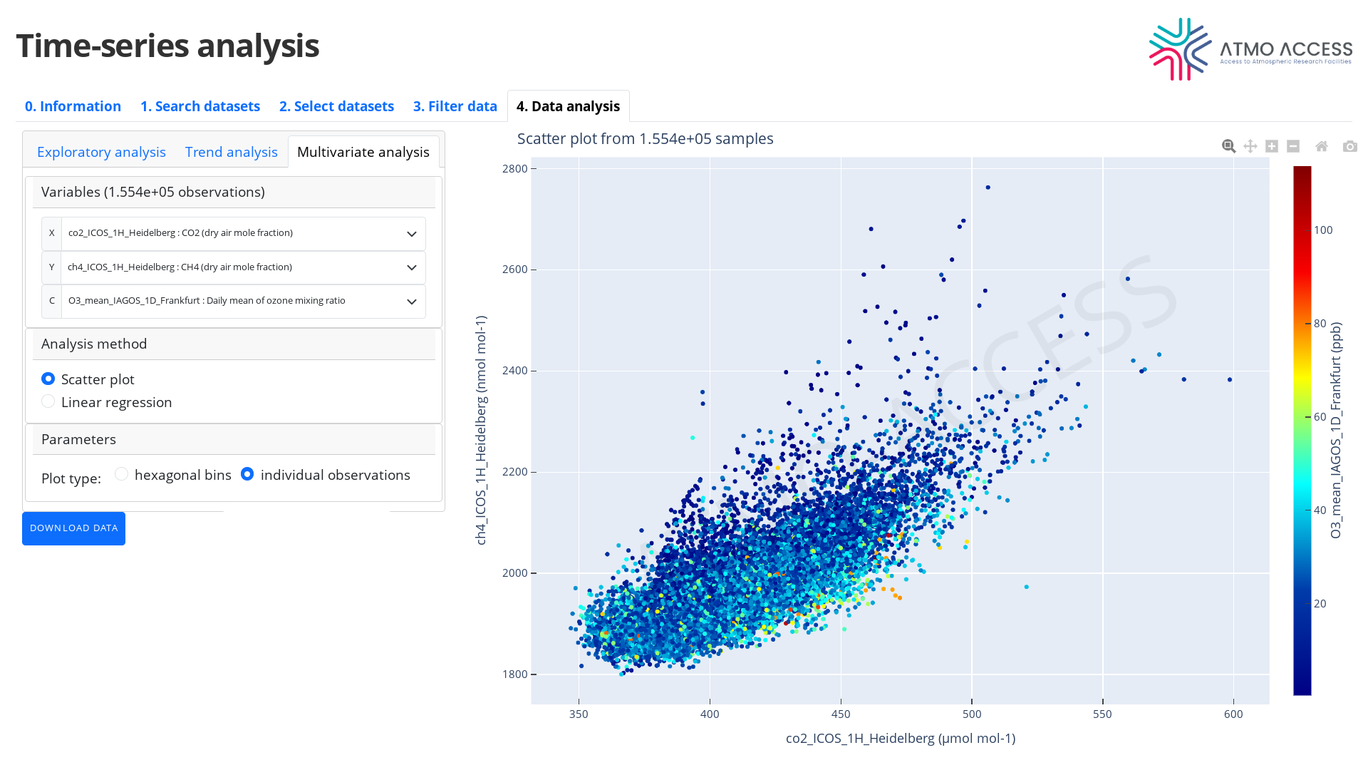
4.3.1.2. Three variables
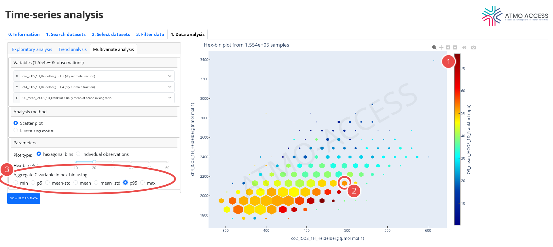
In the case of three variables, the available plots are similar:
- 3D density plot in the form of hexagonal bins (see Figure 12) — each hexagonal bin on the XY-plane is coloured according to an aggregatedvalue (the mean or other statistics) of the component C(1) of observations of X, Y and C falling into the bin. Moreover, the hexagon itself is scaled (2) according to a number of observations of X, Y and C in the bin (i.e. smaller the hexagon, smaller the sample size). The aggregation function of C-variable can be chosen (3) among:
- mean
- mean +/- the standard deviation
- 5th or 95th percentile
- min or max
- 3D plot of individual observations, where observation of X, Y and C is represented as a point on the XY-plane with a colour corresponding to a value C of the observation (see Figure 13).
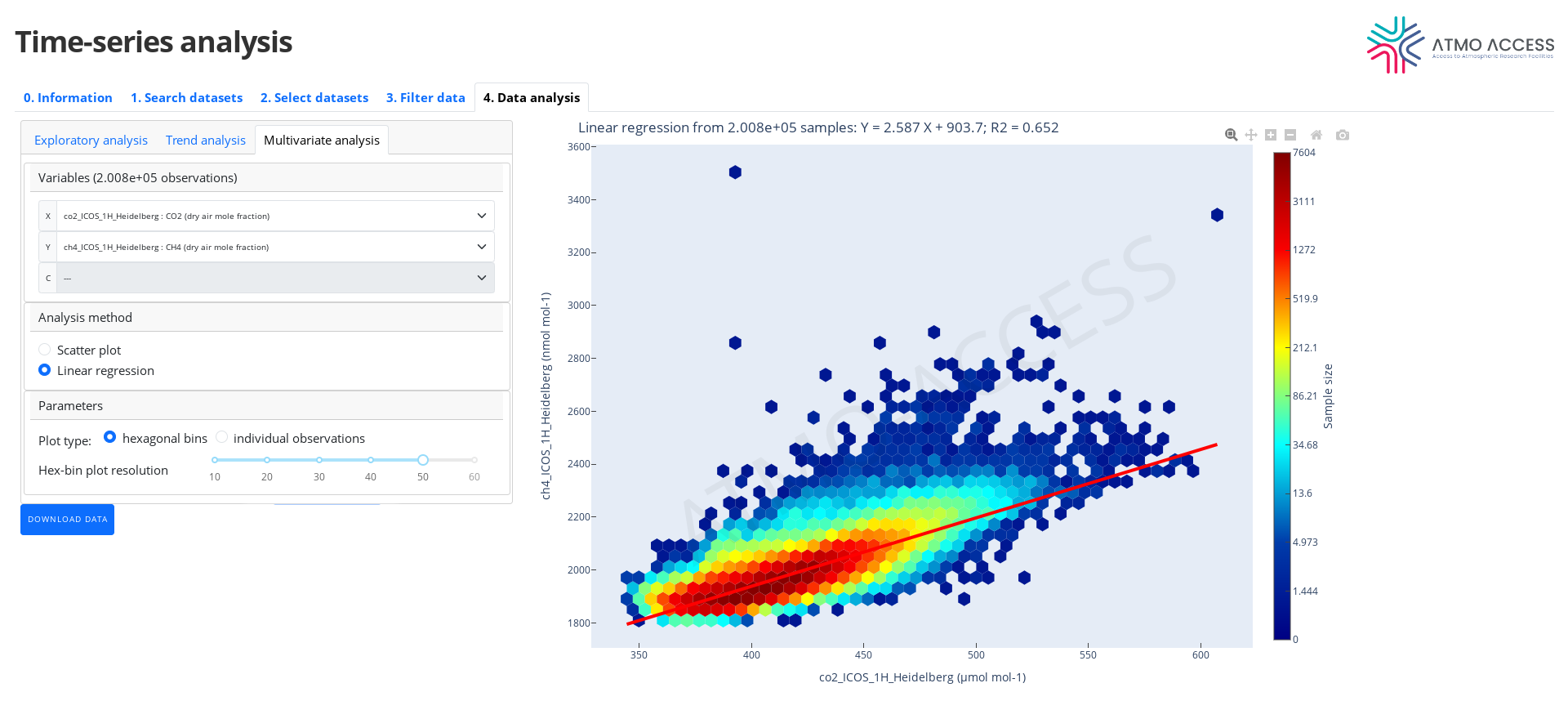
4.3.2. Linear regression
The linear regression method quantifies a linear dependence of the variable Y on the variable X applying the ordinary least squares method. The result of such analysis is visualised in the form of either 2D hex-bin plot (see Figure 14) or 2D scatter plot of individual observations (as described above) annotated with a linear equation of the form
Y = a X + b
which represents an estimated linear fit of Y to X. Moreover, the coefficient of determination R^2 is provided. In the plot, the linear fit of Y to X is shown in the form of a thick red line.